Table of Contents
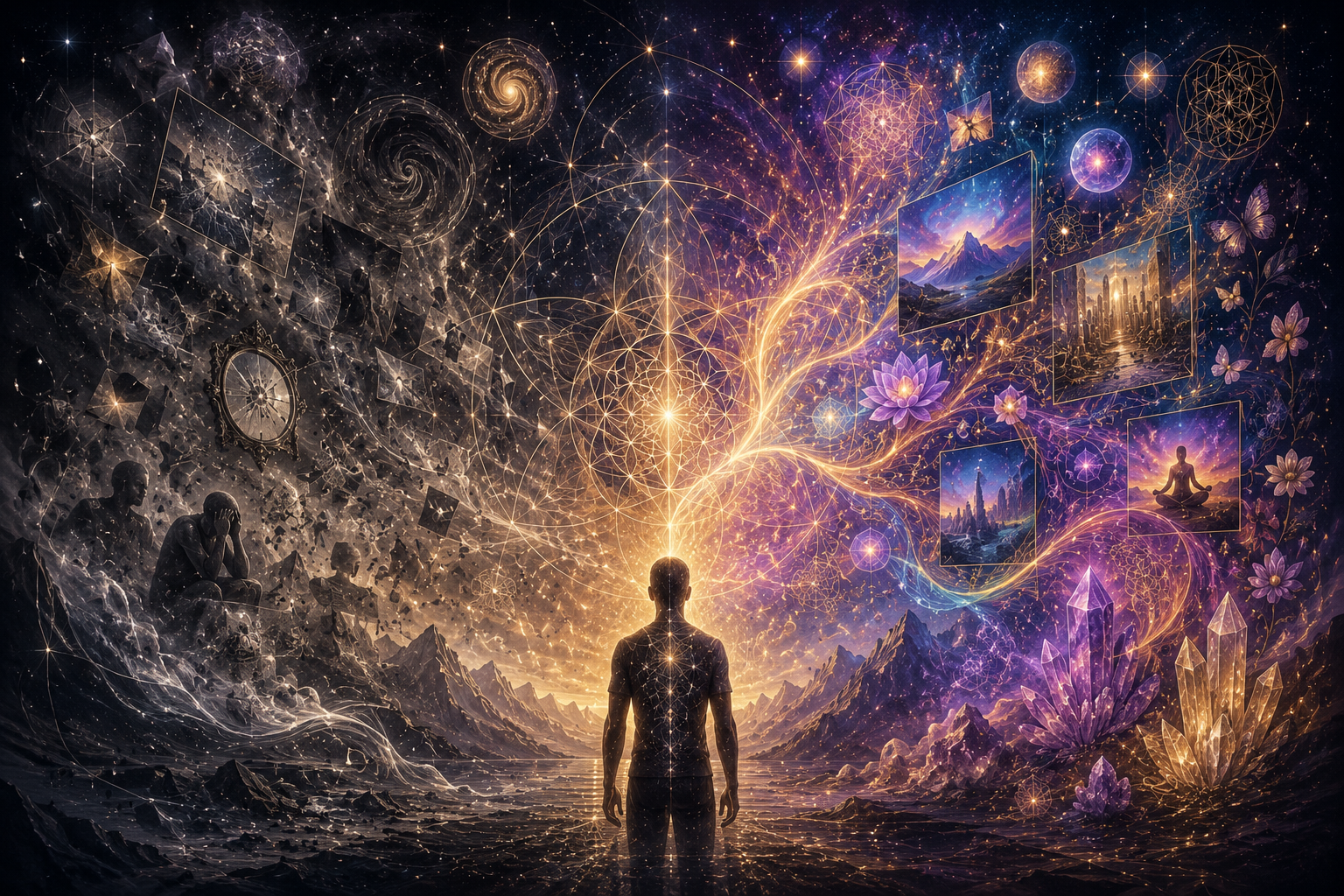
ToggleYou are already designing your reality—whether you realize it or not.
Every color you surround yourself with, every symbol you return to, every visual environment you inhabit… becomes part of the signal you broadcast.
In manifestation, clarity is power. But clarity is not only mental—it is visual.
Your environment, your brand, your digital presence… these are not passive aesthetics. They are active fields of influence shaping how you think, feel, and act.
This is where visual identity becomes more than design. It becomes a tool of alignment.
What Is Visual Identity in Manifestation?
Most people think of visual identity as logos, fonts, and color palettes.
But at a deeper level, it is something else entirely.
- A symbolic language
- An emotional anchor
- A repeated signal to your subconscious
Your visual identity is not just what others see. It is what you continuously see—and what your inner world begins to organize around.
Your subconscious reads visuals faster than words—and far more often.
This means your design is not decoration. It is conditioning.
Why Visual Identity Shapes Your Reality
Manifestation is often described in terms of thoughts and beliefs. But thoughts do not exist in isolation.
They are influenced by:
- What you see daily
- What you emotionally associate with
- What patterns your mind repeats
Here’s how it works:
- Visual input → shapes emotional state
- Emotional state → reinforces belief
- Belief → filters perception
- Perception → influences action
And action is what ultimately builds reality.
Aligned visuals stabilize focus, reinforce direction, and make your desired reality feel natural.
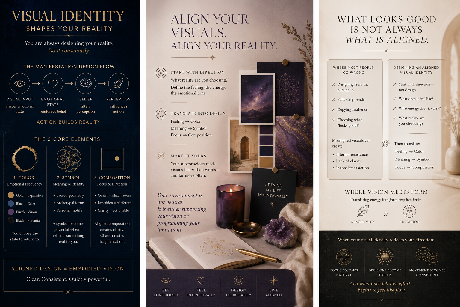
The 3 Core Elements of Manifestation Design
1. Color — Emotional Frequency
Color directly influences how something feels.
- Gold → expansion, abundance
- Blue → calm, clarity
- Purple → vision, higher perspective
- Black → mystery, potential
You are not just choosing colors—you are choosing a state to return to.
2. Symbol — Meaning & Identity
Symbols carry compressed meaning and bypass analysis.
- Sacred geometry
- Archetypal forms
- Personal motifs
A symbol becomes powerful when it reflects something real to you.
3. Composition — Focus & Direction
Composition determines what your mind prioritizes.
- What is centered = what matters
- What is repeated = what is reinforced
- What is clear = what becomes actionable
Aligned composition creates clarity. Chaos creates fragmentation.
Where Most People Go Wrong
Many people design from the outside in:
- Following trends
- Copying aesthetics
- Choosing what “looks good”
But what looks good is not always what is aligned.
Misaligned visuals can create:
- Internal resistance
- Lack of clarity
- Inconsistent action
Designing an Aligned Visual Identity
Start with direction—not design.
What reality are you choosing?
Then define:
- What does it feel like?
- What is its emotional tone?
- What energy does it carry?
Translate that into:
- Feeling → color
- Meaning → symbol
- Focus → composition
This is where design becomes embodiment.
Where Vision Meets Form
There is often a gap between inner vision and outer expression.
Translating energy into form requires both:
- Sensitivity
- Precision
When aligned, your visual identity becomes:
- Clear
- Consistent
- Quietly powerful
Closing
You are always in a relationship with what you see.
The question is whether it is working for you or against you.
When your visual identity reflects your direction:
- Focus becomes natural
- Decisions become easier
- Movement becomes consistent
And what once felt like effort… begins to feel like flow.
If you feel the gap between your inner vision and outer expression, that is where aligned design begins.